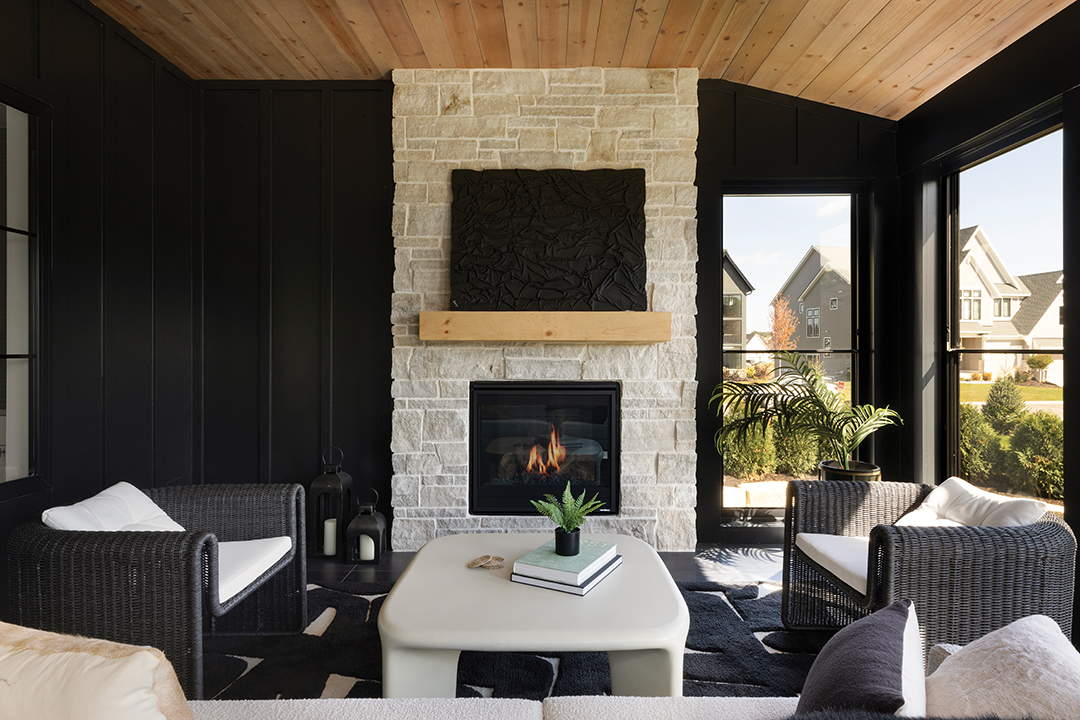
A lightly stained ceiling can offset the closeness of dark walls. Carbon 6 used Barnwood Whitewashed pine from Distress City Millwork for this sunroom painted in Sherwin-Williams Tricorn Black. Photos: Spacecrafting Photography
How to use dark focal points to accentuate your space.
In a design world awash in white, it can be daunting to introduce hues from the darker side of the color spectrum. But Medina’s Carbon 6 Interiors is well versed in marrying light and dark into a cohesive coupling.
Designer and creative director Lindsey Swanson lays out her formula for successful interior design as cohesiveness, consistency and layers of texture. Her equation can be seen in action throughout Carbon 6’s recent projects in Plymouth’s Hollydale neighborhood, which are connected by a thread of high-contrast pairings of blonde wood, white walls and dark accents.
“There’s just a lot of visual interest, and it’s not boring,” Swanson says in regard to Carbon 6’s transitional modern style for its model homes. “We have a lot of out-of-state clients that come in looking for a home that’s ready to move in to or close to ready to move in to. [They] see our work, and they’re like, ‘Oh, I’ve never really seen that done before.’”
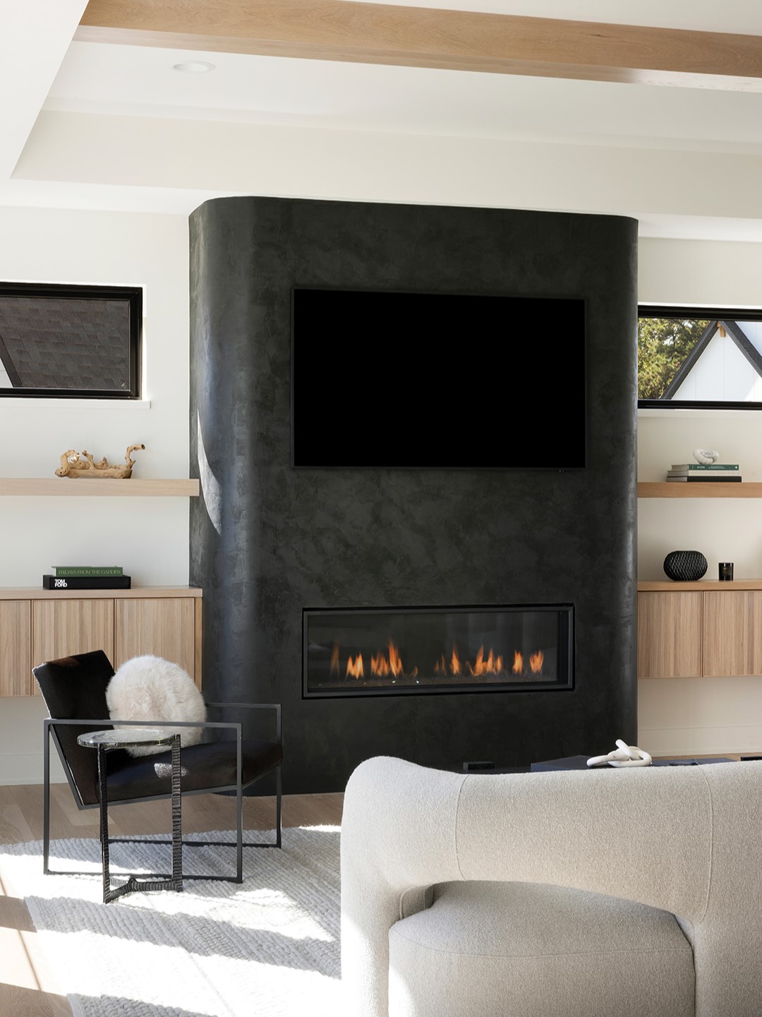
This 8-inch radius cornered fireplace is painted in Roman Clay’s Fade to Black. “We had never fully painted a fireplace in this Roman Clay brand or this color before,” Lindsey Swanson says. The high contrast grounds the space while adding an interesting focal point to the living room.
Moody shades don’t have to overrun a space—although there are some instances where darkly drenched walls can work to your advantage. Swanson breaks down some of the wheres and whys high-contrast design works throughout different areas of your home.
Lounge
Dark shades have a reputation of visually shrinking a space, especially when employed on accent walls. Swanson says a full color drench lends itself to restful lounge spaces or a moody home office.
Not all contrasts need to be man-made, and sometimes nature supplies its own striking counterpart: natural light. “We tend to go darker in sunrooms and porches because usually the walls are mostly windows,” Swanson says. “It just makes it feel cozier and a little bit more private.”
Entertain
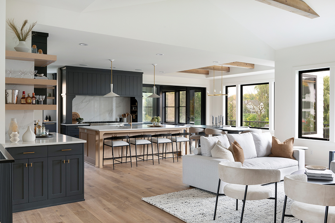
This kitchen’s range hood and built-in cabinetry are painted in Cheating Heart by Benjamin Moore. “I love how the corners of the hood tie in with the arches of the island where the seating is,” Lindsey Swanson says.
For gathering spaces, dark colors serve as a way to direct attention to an architectural focal point in the room. Think about how you want to ground your space and where guests tend to gather. Do you want to draw them to the fireplace or encourage them to gravitate toward the kitchen island?
Dark hues don’t automatically mean one-note. To play with both color and texture, Carbon 6 uses the dappled effect of Roman Clay, a modern counterpart to Venetian plaster. “We are really loving the darker Roman Clays right now and the darker lime washes versus just painting a fireplace black or putting a black large-format tile on it,” Swanson says.
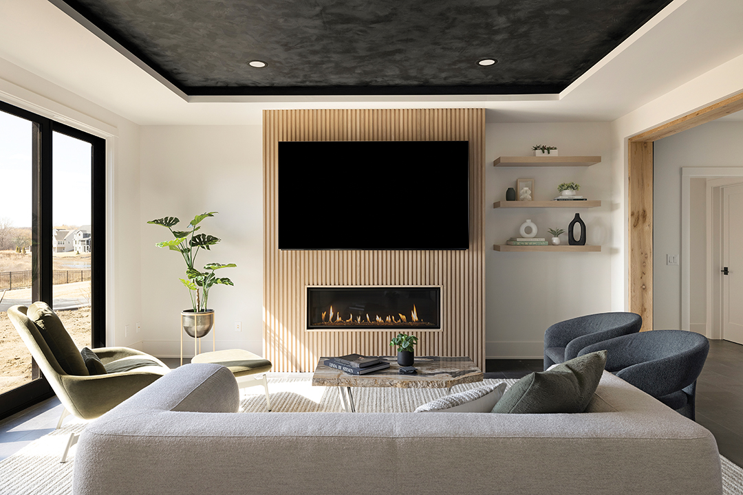
This 6-inch recessed ceiling is painted in Roman Clay’s Fade to Black. “It allows the space to be more defined and gives it some interest without totally taking over because it’s a higher ceiling,” Lindsey Swanson says.
Texture also comes into play in backsplashes. Carbon 6 often uses a slab of the countertop stone in backsplashes for a seamless and easy-to-clean finish.
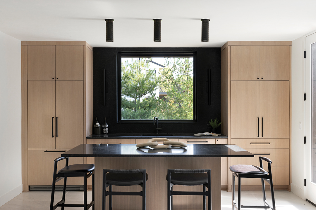
The backsplash of this lower level bar uses the same granite as the countertops. “It’s got a very faint, warm beige veining that goes throughout,” Lindsey Swanson says. The black monopoint lights above the island contain small openings that diffuse light. “It adds texture in a way that’s a little bit different,” Swanson says.
Work
There’s an added practicality to darker cabinetry in working spaces, including mudrooms and laundry rooms. Put simply, “It hides dirt better to go dark,” Swanson says.
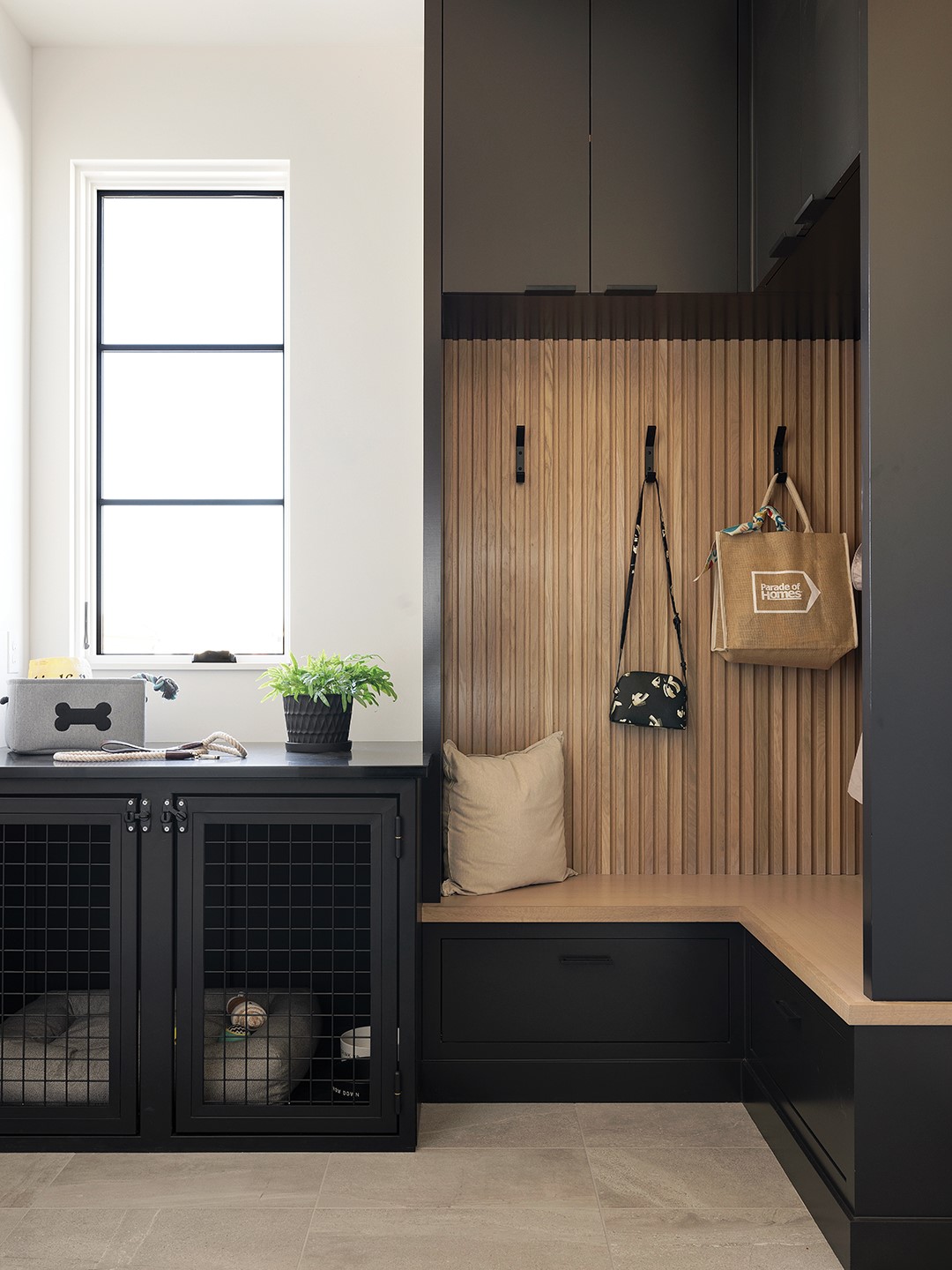
This specific mudroom pulls double duty as a dedicated dog house. Dark cabinets in Sherwin-Williams Black Magic, which match the kennel, are accented by durable white oak wood slat.
Carbon 6 also favors stained white oak for working spaces due to its hardiness. “With white oak being stained, if anything ever dents it or chips it, you can’t really tell,” Swanson says.
Carbon 6 Interiors
Instagram: @carbon6interiors